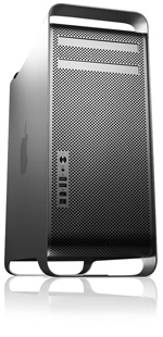
New iMac
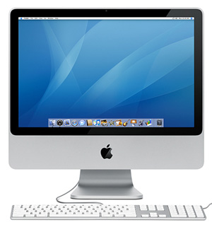
Apple have released the latest version of the iMac, the “all in one” computer where you get what looks like just a monitor with a keyboard and a mouse. It’s not a new concept, either in terms of Apple themselves (since the original iMac came out nearly ten years ago) nor in terms of computing in general, making reference to the days when many computers and terminals were manufactured in this format.
The new iMac has clear evolution with its predecessor, which is a departure from the predecessor’s own evolution; until now, with the exception of the third and fourth generation iMacs (which were outwardly identical with different guts), each iMac has been significantly different from its predecessor. I think it looks quite nice apart from the black surround on the screen. I prefer the glossy white Mac style, as does Chris, but I do like the aluminum design; that’s working well with a number of models in the Apple range at the moment.
The new iMac brings with it the latest designs of Apple keyboard, which are shipped with the new iMac and Mac Pro and are also sold separately. As far as I can tell and ignoring eBay, you can now no longer buy the old style keyboards. This I have mixed feelings about, for two reasons.
Firstly, here is the new wired keyboard. It’s nice looking and very slim, but is basically a laptop keyboard. Indeed its keys are identical to those on my Macbook. This is not to say that I dislike my Macbook keyboard, I don’t, but using a laptop keyboard with a desktop computer doesn’t feel right and I think I’d prefer a “proper” keyboard.
But then we move on to my second concern. The wireless version of this keyboard really is just a Macbook keyboard in an aluminum case, with the same number of keys and the same keyboard layout. Previously the wired and wireless keyboards were identical in their appearance, size and layout, so why Apple have chosen to force a differently sized keyboard on those who want a wireless model is beyond me. I could just about cope with the “full size” wired keyboard, laptop keys or not, but this would just piss me off.
But this happens every time. Apple are very good at trumping themselves with the design of their products and they’re not afraid to be radical. Every time they bring something out that looks unusual people are either totally in love with it straight away or say that they’ll never get used to it, but always do.
Returning to the subject of the iMac, I think that Apple could improve the scope of this product very easily. iMacs come with a built-in monitor, as you can see, but they also come with an extra monitor port on the back to which you can connect a second screen. The trouble with this is that no second screen, even Apple’s standalone displays, will match the iMac and you’ll always have this odd juxtaposition of mismatched equipment if you do choose to connect a second display.
The solution to this is simple. Apple should sell a range of monitors that look just like iMacs. They’d be easy to produce, since they would actually use iMac shells and iMac screens; they’d just not put the guts of a computer inside. They already have all the tooling and components available to do this, and I think it would be a great way of allowing people who use their iMac as their primary work computer to use a matching second display without having to plump for a Mac Pro which, although nice and fast, are expensive when compared to the iMac.
I’ve done a mockup of what such a setup might look like. Tell me that this isn’t a good idea? If it happens, you read it here first ;)
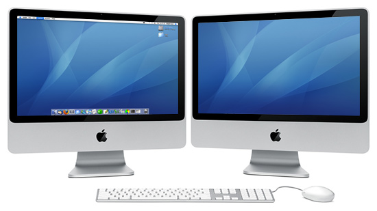
Mockup of dual-screen iMac
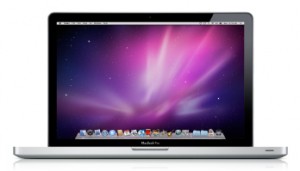 Finally, after nearly four years, I have a new laptop, a 15″ MacBook Pro, with all the trimmings. It’s not brand new, I bought it from a friend who, perversely, wanted a smaller laptop after owning this one for six months. I wasn’t going to complain though, as it’s two grand’s worth of kit with two and a half years’ worth of AppleCare left for just over half its original cost.



 For a long time I never thought I would ever get to this point, but it’s now official: I don’t use Microsoft Windows any more. I have decided to stop using my PC at home in favour of using my