Uncategorized

Home energy monitor reveals consumption horrors

I’ve moved flat recently (all planned, fancied an upgrade and the right opportunity came along), and my new flat is situated close to to the cupboard on my floor where the electricity meters are kept. This differs from previous apartment buildings in which I have lived because in those buildings the meters were all in the basement, far far away from the apartment itself. This prevented me from using an energy monitor, because for them to work you need to install a transmitter on the meter and that transmitter needs to be within a certain distance of the receiver inside the apartment.

Keen to work out why I kept getting over usage bills from my own employer, I bought an Owl Intuition-E and Micro+ bundle, which gave me the transmitter, the receiver and a network receiver, which allows me to upload usage data over the Internet to their online portal for analysis. Being within 30 metres of the meter, it works a treat.

I was a little surprised, however, with the results it gave me. I’ve found out the following:

  1. My television, surround sound and Bluray setup in the living room uses 60W on standby. 525 kWh per year (£78.75). I put a remote controlled socket on that lot straight away. I have no idea why 60W is necessary to keep four items AV equipment on standby.
  2. The TV / stereo setup in the bedroom uses 16W on standby. Another 140 kWh per year (£21.00) saved with another remote socket.
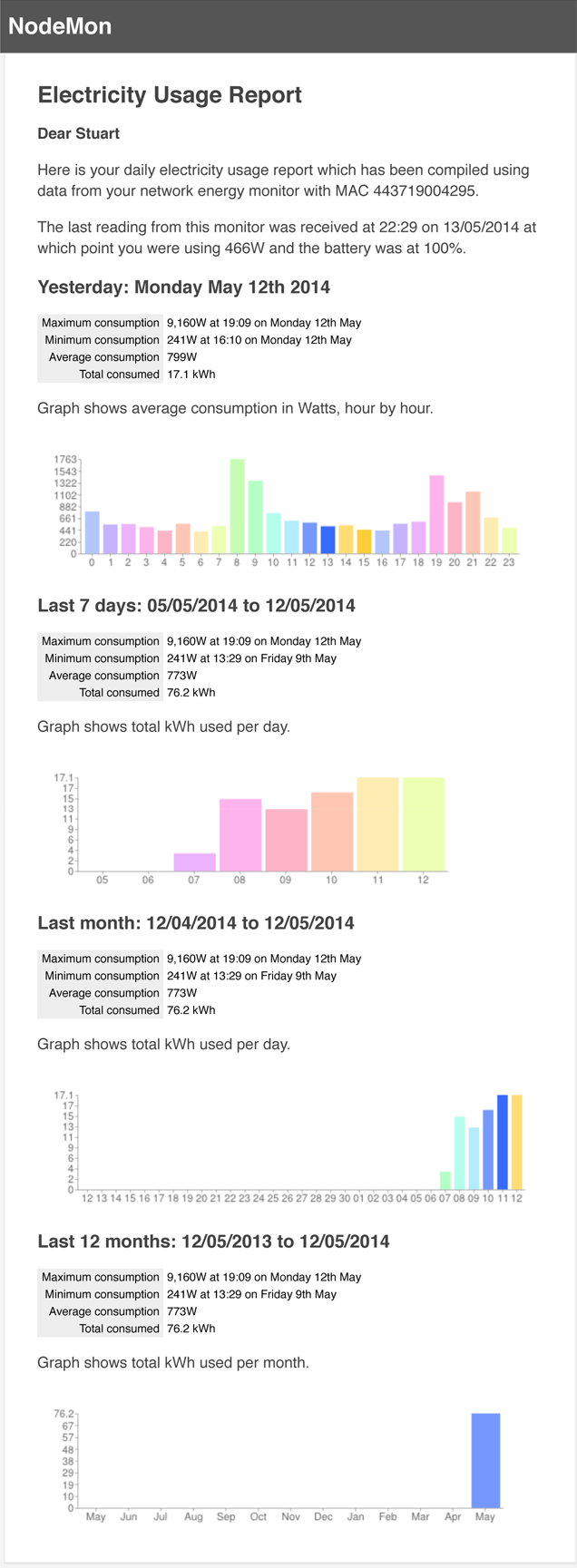
  3. I use a minimum of 241W. It never goes below that. This is during the day with no lights on (not that they bother me much, they’re all LED), with the fridge/freezer on (60W), my server and networking gear on (90W – this is lean, trust me) and my desktop computer on (60W), but with my monitors and everything else switched off. This means that there’s still 31W of background usage, 24 hours per day (271 kWh per year, £40.73).
  4. Consumption has been as high as > 9kW. This, presumably, was when I had the water heater and the cooker and the microwave and the telly on at the same time. Fortunately periods like this are always short-lived.

It’s a really good product, works very well, but I absolutely hate the web portal you have to log in to view your statistics. It’s awful. Fortunately, the network device can be configured to also sends its readings to a specified IP address on a specified UDP port, which is exactly what I’ve done and I store all my readings in a local database with a collector listening on that port. I then wrote my own software to analyse it and now I get a report like this every day. To this I have also added a web browser dashboard.

daily-electricity-report

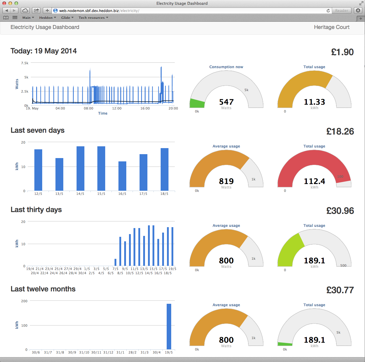
Update 19/05/2014: I’ve now created a web dashboard (which also works well on mobile devices).

Screen Shot 2014-05-19 at 20.03.27

Code’s here if you’re interested (NodeMon isn’t really a thing, just a project framework for various bits of tinkering). Needs Phalcon.

Uncategorized

A very Angular learning curve

Recently my team at work have been working with Angular JS, a Javascript framework created, used and published by Google. We’ve used it extensively in our new website, which is created from static HTML and Javascript files with no server-side page generation. All the work is done by the browser and user interaction is processed using a REST API.

AngularJS-large

I didn’t actually do any of the coding on the website and so I did not have the opportunity to learn how to use Angular JS during the project as the rest of my team did, so in order that I did not fall behind on the skill I decided to learn it myself in my own time by creating a web-based tool which creates DHCPd configuration files. The application is boring (although actually useful if you run such a server), but that’s not the point, it was a learning exercise.

Angular JS has a bit of a learning curve. It works in different ways to other Javascript libraries and frameworks and it takes a while when you’ve started from scratch to “think Angular”, rather than in ways in which you may have become accustomed with things like jQuery, itself revolutionary in the world of Javascript, but Angular takes it to a whole new level. Once you are “thinking Angular” things become much clearer and easier and you find yourself in a very natural-feeling flow.

I’ve made the exercise available on Github. You may find the tool itself useful if you’re a system administrator, but if you’re a developer it’s more likely the demonstration of a simple Angular application that you will probably see more value in.

I have some larger extra-curricular projects around the corner which I intend to base on Angular JS and expand my knowledge. We’ll also continue to use it at work and will almost certainly use it when it comes to re-implementing the user interface of the company’s internal browser-based management system.

Uncategorized

MRTG Dashboard

I’m one of those die-hards whose been using MRTG for almost as long as I’ve had a computer with a network connection. It’s an old tool for monitoring network traffic and its not pretty by modern standards but it does still do that job very well. However, its blocky output does rather leave much to be desired in this day and age of interactivity and so I’ve knocked together an MRTG Dashboard.

It’s a single PHP script which you just pop in your MRTG output directory (workdir) on your PHP-enabled web server. That’s all you need, all the required libraries are loaded from CDNs. It’s not perfect, but it is an improvement.

MRTG Dashboard screenshot

MRTG Dashboard screenshot

You will find that the timescales on the interactive graphs can be a little hit-and-miss. This is because while Highcharts demands data at consistent intervals when creating time-based graphs MRTG’s data is anything but consistently intervalled. I will try to improve this at some point in the future.

You can get MRTG Dashboard from Github.

Uncategorized

Cadburys Olympic Podium Clock

I worked on a couple of extra-curricular projects over Christmas, one being a a project for Cadburys, who are touring the country over the next six months before the Olympic Games with three podium-style stands on which punters can attempt to win one of ten pairs of tickets to the opening ceremony by estimating how long exactly 20.12 seconds is. These will appear in various shopping centres and exhibitions over the months.

Punters press the big red comedy button to start and press it again to stop, and no, they don’t have view of the screen while they’re playing. If they win there’s a winning sequence of sounds and words on the display and the operator also activates four flashing purple police lights. It’s pretty much impossible to estimate correctly, however, even if you do have sight of the screen.

My job was to create the software for this including all the graphics, which I did using my normal skill-set of HTML, CSS and Javascript/jQuery (no server-side stuff required, runs on a laptop without an Internet connection). I’m also able to push out software updates to each of the three stands over the next six months should they for some reason become necessary.

The screens in the photo below will be installed within the podium-style stands themselves and only the clock digits themselves will be visible through the aperture in the front (simulated by the crude paper surround on the screen on the right). The purple bar at the top of the screens is only visible on the operator’s laptop and contains some basic options and settings which aren’t publicly visible. The red button is custom built and contains a USB numeric keypad with a mechanism that presses the “5” key. This then simply plugs into the laptop as a USB keyboard.

It was a nice bit of fun. It’s not a million miles away from the sort of things I used to do when I worked for 2Heads back in 2000/2001, so almost a little nostalgic. No plugins or flash either, all HTML5, CSS3 and jQuery, as it should be.

Testing the displays and the comedy red button

In action in the Birmingham Bullring during March 2012